
Portfolio > Visual Design > LMS Layout
I designed the landing page layout for our LMS – ThinkingCap. The design was made in Adobe XD.
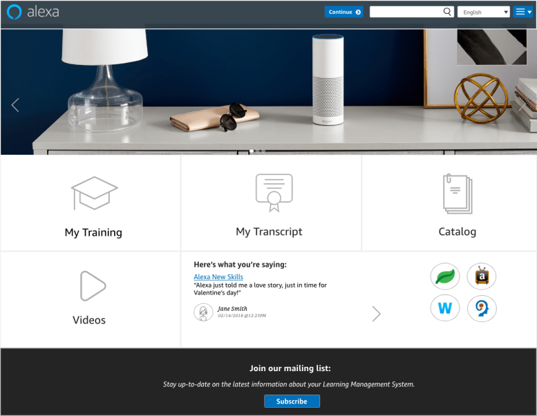
For the UI, I went with a clean and minimalist design, inspired by the Alexa Branding. I used colors, icons and typography consistent with the Alexa Style Guide. This will give the users a sense of familiarity with our product.

For the layout, I went with the use of tiles to highlight the features available, which provides a clean and user friendly interface for our learners. I also used a Carousel to display information and updates about our team. The one in the picture is a small video I created in GoAnimate. This will be a weekly feature with the topic of the video changing to showcase updates from our team or the Alexa word.
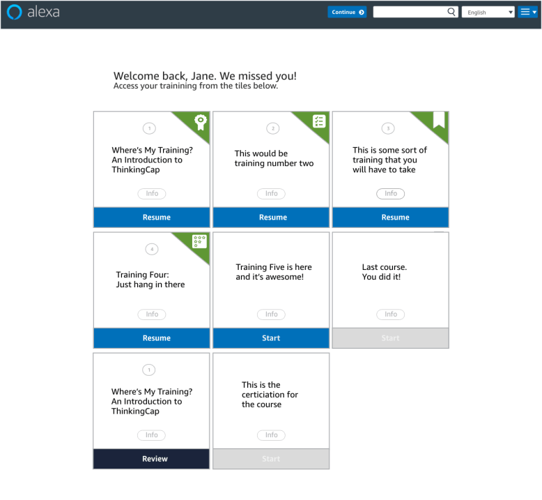
I also created the My Training page layout where it shows the student’s learning path. This is consistent with the landing page layout. I used the concept of tiles for a clean and easy visualization. The courses are marked by icons identifying what type of object they are and the strings are clear and concise.
